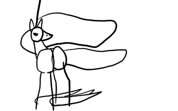
Changed up my Rapidash sketch.
I'm not really feeling it just yet though.
I like the concept, but I don't really feel the composition is Good Enough to Win just yet. And I'm not sure what I'd change to get it there.
I'm not really feeling it just yet though.
I like the concept, but I don't really feel the composition is Good Enough to Win just yet. And I'm not sure what I'd change to get it there.
