
why is every Google app a horrible colorless wasteland of whitespace now
what happened to having clear separators between stuff
wait
Android P doesn't even have a proper dark mode? I thought that was what the redesign was for
oh! in the Google calendar app, the redesign actually includes a dark mode… so why doesn't it in Gmail, or the Store?
long
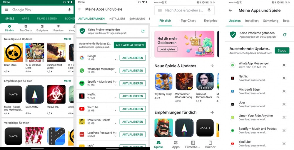
@aperezdc oh, I'm quite happy with the original Material Design, the floating button might not be the greatest idea but it was a unifying design language and it looks neat. What I'm talking about is the new (I guess it's still Material? idk) redesign that removes the color from the top and the multiple layers (see the right two screenshots). The iOS-style bottom navigation is good though
Also I don't see any "overly round corners". Material design always was more rectangular, and in a good way, I don't think that has changed, but I also don't dislike rounded corners on stuff so 🤷
oh yeah also the original material design text-only buttons are all all-caps

also accent colors, everything looks the same now