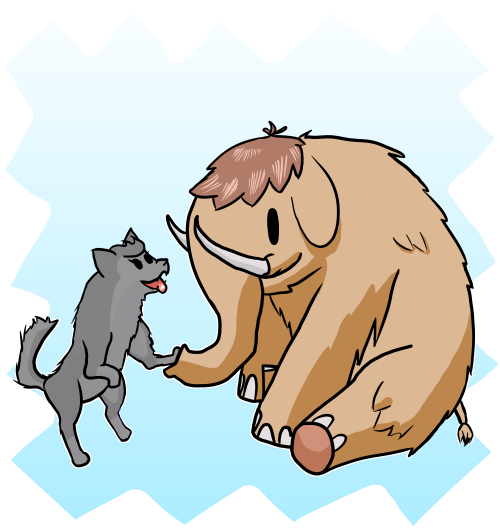
@anthracite I do have plans for big art cut-ins for the the dramatic attacks! I just haven't got to the art bits for those yet. (Or at least implementing them, since they're often tied to other characters, not the party members.)
That said, I do like seeing art of characters in the likes of Etrian Odyssey, the option to have them in the action UI would be nice perhaps.
@Aether @anthracite oh this whole aesthetic looks really cool here, i like it a lot
-F

Awoo.space is a Mastodon instance where members can rely on a team of moderators to help resolve conflict, and limits federation with other instances using a specific access list to minimize abuse.
While mature content is allowed here, we strongly believe in being able to choose to engage with content on your own terms, so please make sure to put mature and potentially sensitive content behind the CW feature with enough description that people know what it's about.
Before signing up, please read our community guidelines. While it's a very broad swath of topics it covers, please do your best! We believe that as long as you're putting forth genuine effort to limit harm you might cause – even if you haven't read the document – you'll be okay!
Trending now
Resources
Developers
awoo.space
- v3.5.3+glitch