
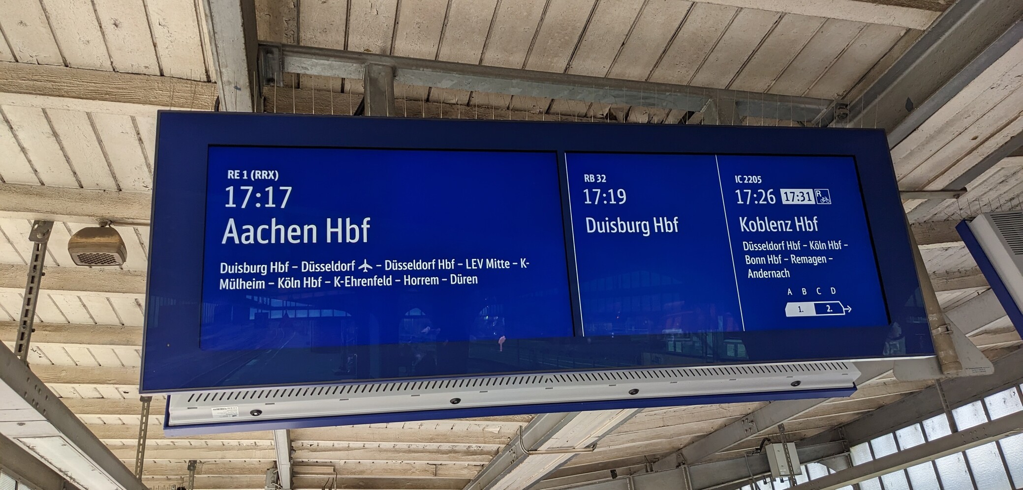
here's a better look at the new (to me) DB digital signage. it does look very pretty but the fonts are also quite small compared to before
I thought it was one continuous panel but it's obviously two when viewed head on. Still a lot more seamless than the four low-res displays they used before
DB has some of the nicest signage typography in general, I love how they split the signs to create logical separation and deliberately not center anything. Also that font rules
Follow
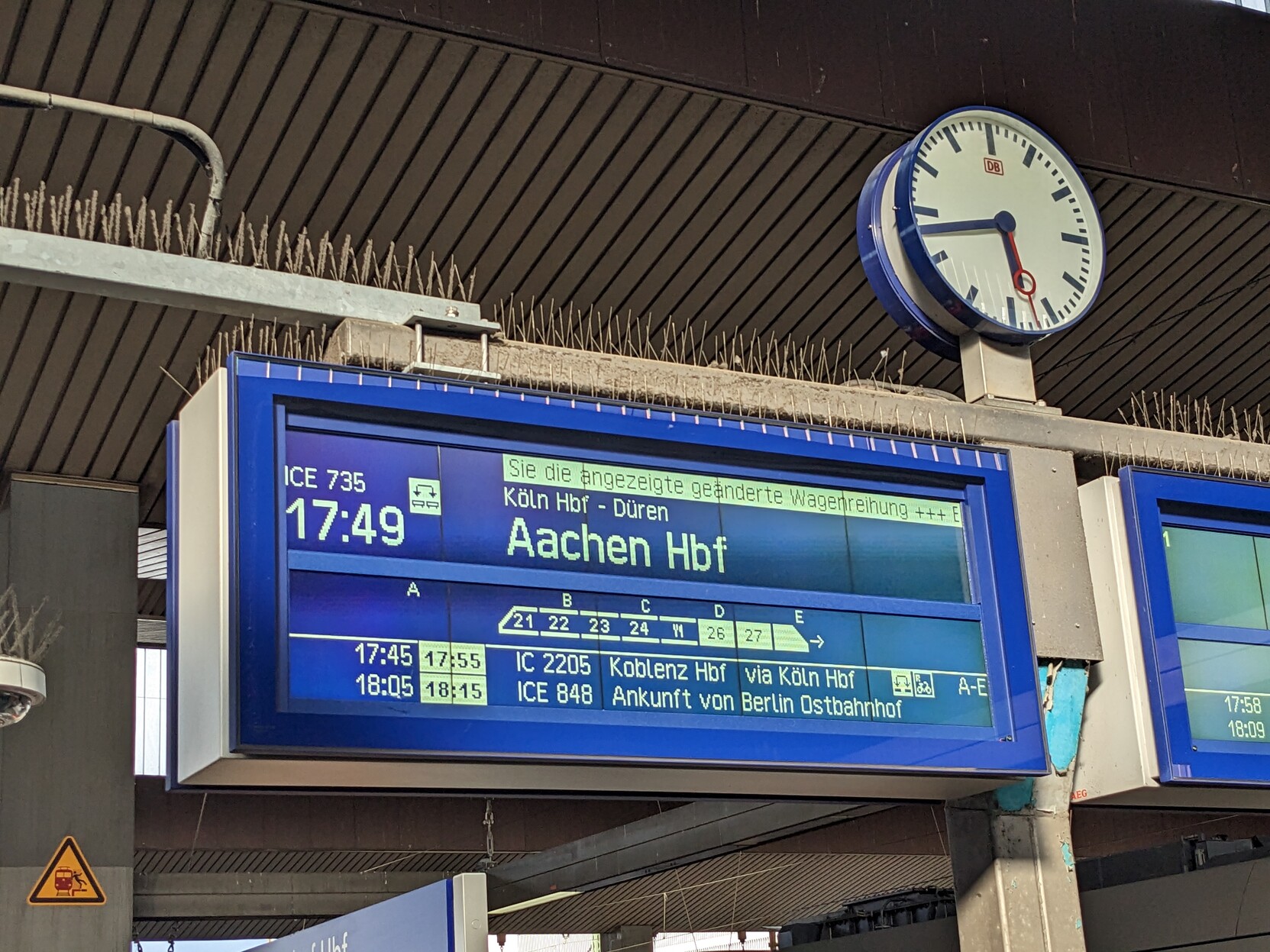
here's the older version of the same display, they slowly started putting more information on there, like where which cart will stop, so it's quite cramped these days
@starkatt it's some impressive pixel art work

@noiob oh that's gorgeous