Linux UX opinions 

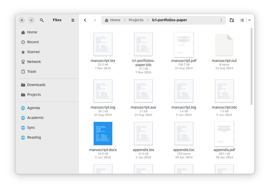
This terrible window is a great encapsulation of a lot of problems with modern Linux design choices (see image description for details)

There's three unlabelled menus in the title bar; guess what options are in what menus! There's literally no other way to know

What part of the window do you click on to move the window? There's no visual cues to tell you that either

And there's no way to add a theme to fix the parts that make it difficult for use for people with bad eyes

Linux UX opinions 

Seriously

Can you tell if this window is scrolled up to the very top, or is it just close to the top?

Follow

Linux UX opinions 

@researchfairy the gnome file manager is the first thing I replace on a fresh install (I prefer Thunar) but I mean, I can just nudge the trackpad/scroll wheel a little and I'll know where I'm at

Sign in to participate in the conversation
Awoo Space

Awoo.space is a Mastodon instance where members can rely on a team of moderators to help resolve conflict, and limits federation with other instances using a specific access list to minimize abuse.

While mature content is allowed here, we strongly believe in being able to choose to engage with content on your own terms, so please make sure to put mature and potentially sensitive content behind the CW feature with enough description that people know what it's about.

Before signing up, please read our community guidelines. While it's a very broad swath of topics it covers, please do your best! We believe that as long as you're putting forth genuine effort to limit harm you might cause – even if you haven't read the document – you'll be okay!