
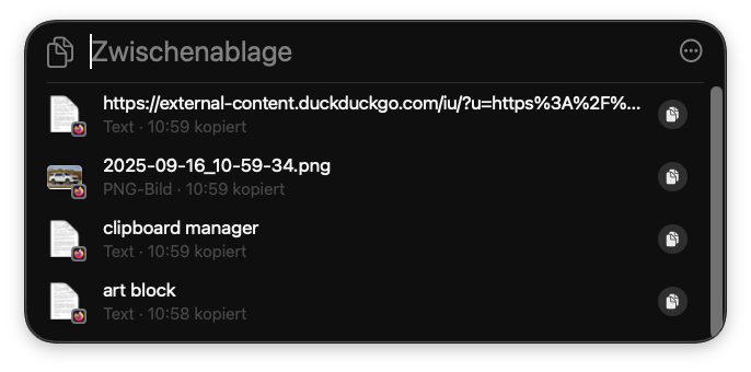
oh, did apple finally add a clipboard manager to macOS (kind of)
this works well enough but there's zero settings except "on" or "off", keeping stuff for 8 hours is a reasonable time ig. I think I'll keep Maccy installed for now
Follow
look, I can respect a well-designed icon theme on an Android phone (never used one bc the unthemed apps stick out like a sore thumb) but I thought we all agreed that it's just a silly thing? like the pixel launcher monochrome icon variants that don't even extend to its own app drawer is where I draw the line. Also Apple's alternative icons are just butt ugly lmao

also this would've been the perfect time to add a glass theme to Chess.app smdh